Related Topics
No topics are associated with this blog
Torie
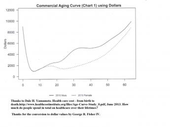
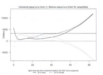
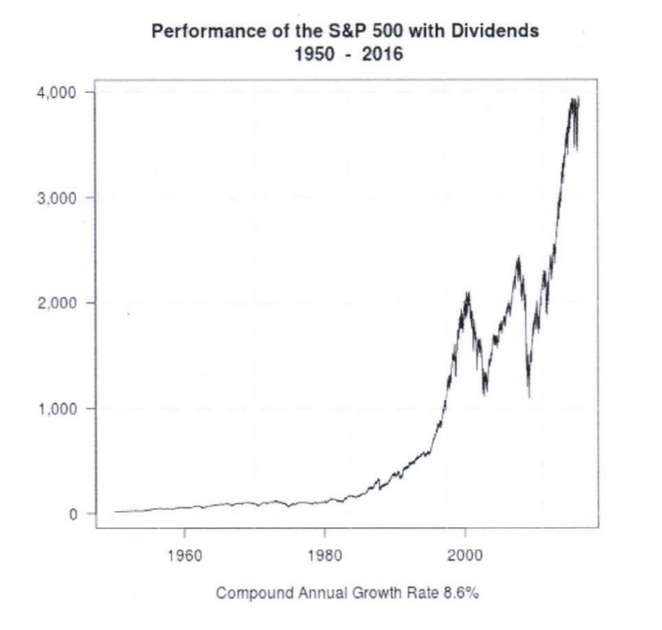
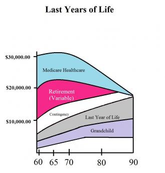
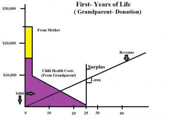
The first graph is a family of curves, showing what we are already spending per person for healthcare, compared with the revenue could be projected by investing the same amounts at several rates, and not spending any of it for health. The graph shows the revenue as it enters the system, at various interest rates, from birth to age 90. It's unrealistic because it assumes no cost for health, all of the money going for retirement income. But it's the theoretical maximum to be achievable for retirement alone at present, at the longevity predicted, by the time you reach it. It's pretty convincing we have enough money for retirement if we don't get sick. The second graph chooses 6.5% compounded quarterly as the present achievable maximum net after inflation, imagined as a more realistic maximum, and subtracts present levels of health expenditure at various ages, produced by the Secretary of Health. The third comparison is the recirculation of a $400 subsidy at birth, assuming the Affordable Care Act or its replacement is cost-neutral from age 25 to 65, adding the present level of withholding tax for Medicare during the working years, and no premiums thereafter. All of those graphs are designed to show what we have to work with, under various assumptions, all of them including the present cost of Medicare. The final two graphs show the addition of the first and last year of life subsidies at $400 at birth compounded at 6.5%, with and without current levels of spending (the addition of 3% revenue inflation is in theory offset by a 3% inflation of costs).
|
|
|
|
|
|
||
|
|
|
|
|
Originally published: Friday, May 06, 2016; most-recently modified: Thursday, June 06, 2019